
Grouping Tables (to show summary statistics)
Overview
In this article, we understand a technique for Grouping Tables, and creating a calculated column, to show a summary statistic.
Using Power Query to create summary statistics
Power Query has excellent grouping capabilities, which can be used together with calculated custom columns to create summary statistics right out of a dataset.
To illustrate this, consider the following case of a car manufacturer that has provided the following data:
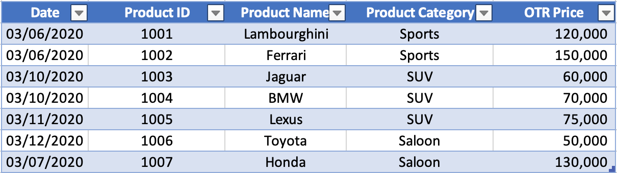
The goal is to work out two things:
- Total sales for each day, by Product Category
- The top selling product as a percentage of daily sales, for each Product Category
Steps
1. Connect the data
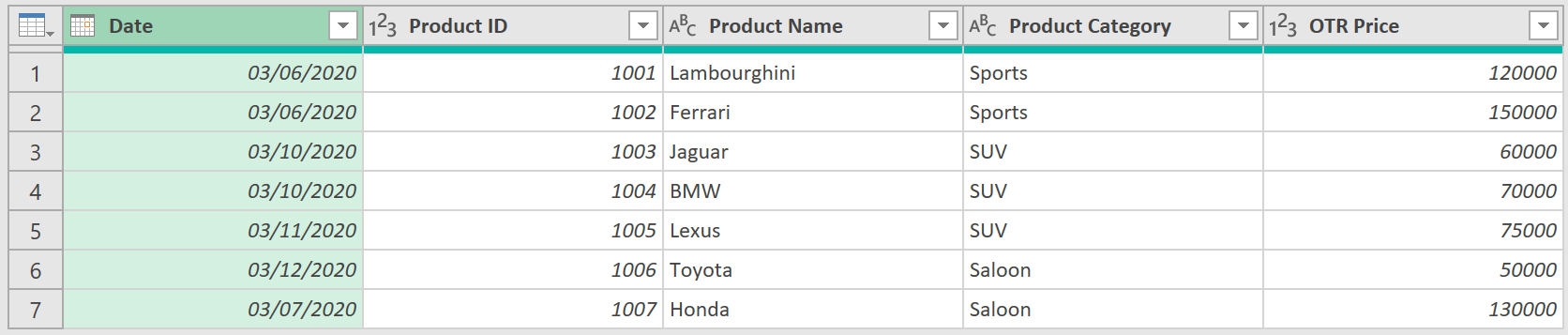
To start, load the table into Power Query
- Select any cell in the Table ➔ Data tab (in Excel) ➔ From Table/Range icon
- Right click the Date column ➔ Change Type ➔ Date
The table can now be summarised.
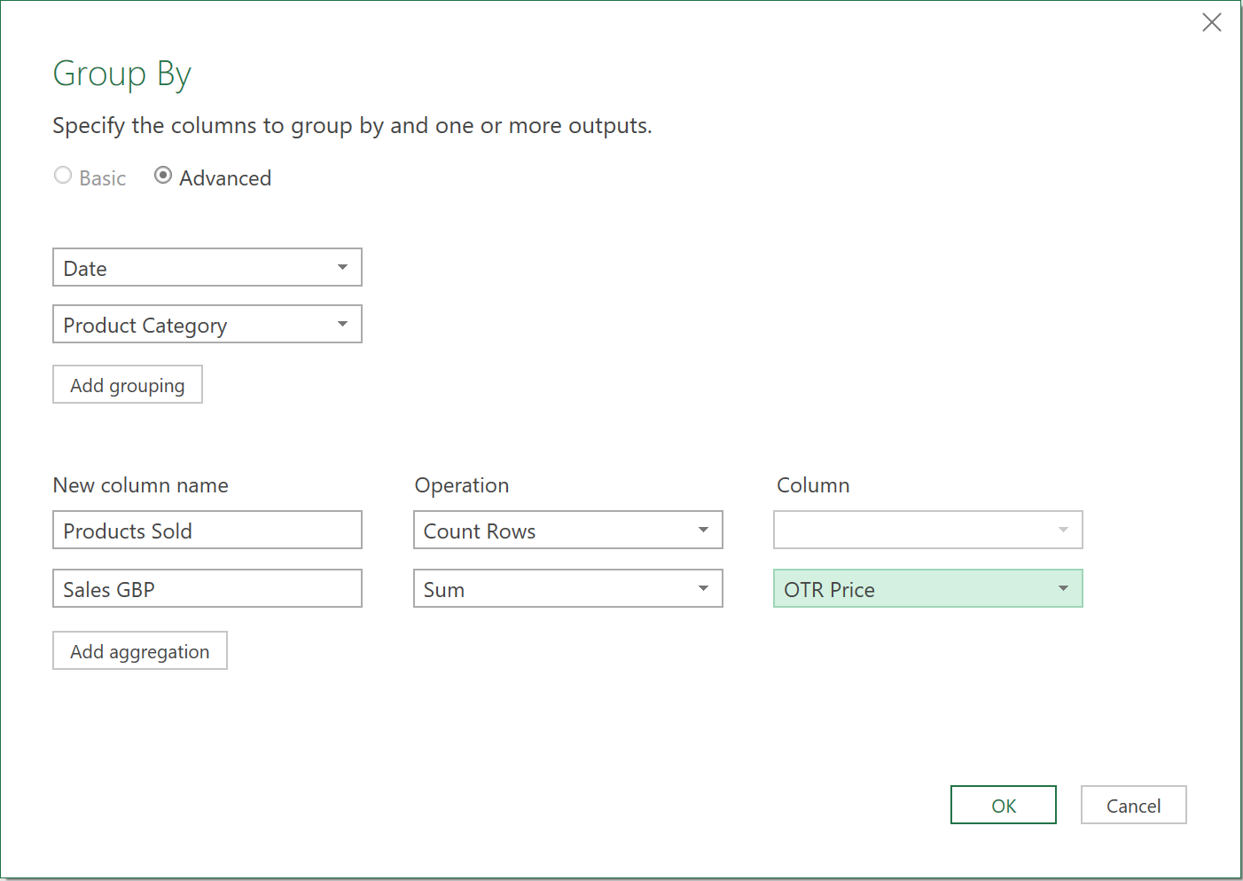
2. Group the data by Date and Product Category
To group the data by Date and by Product Category
- Select the Date column
- Go to Transform tab ➔ Group By icon
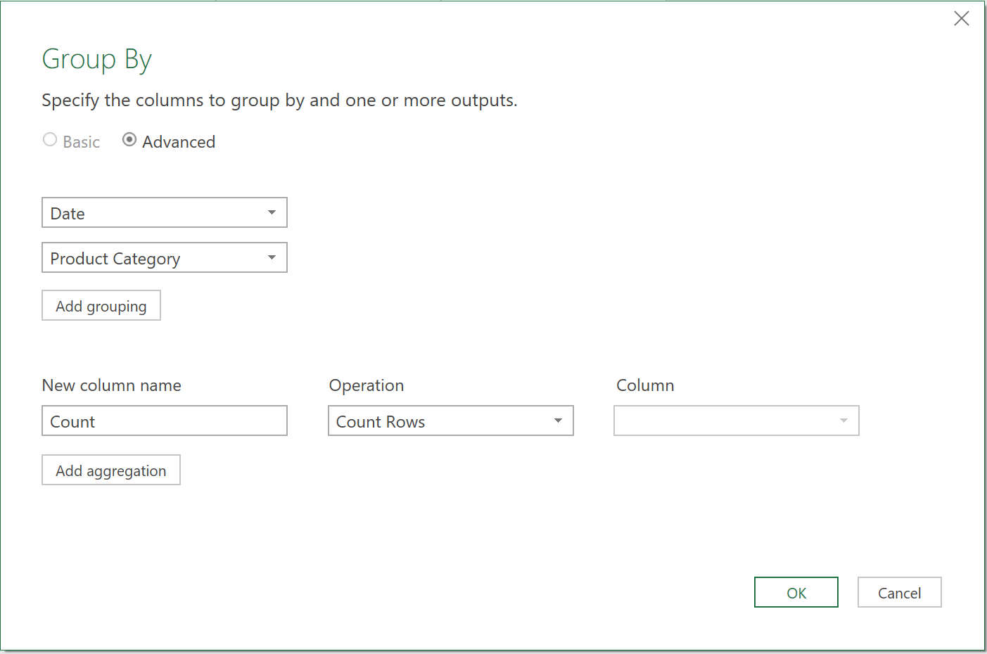
The new window that appears gives you the ability to define the items you want to group and how you’d like them to be grouped.
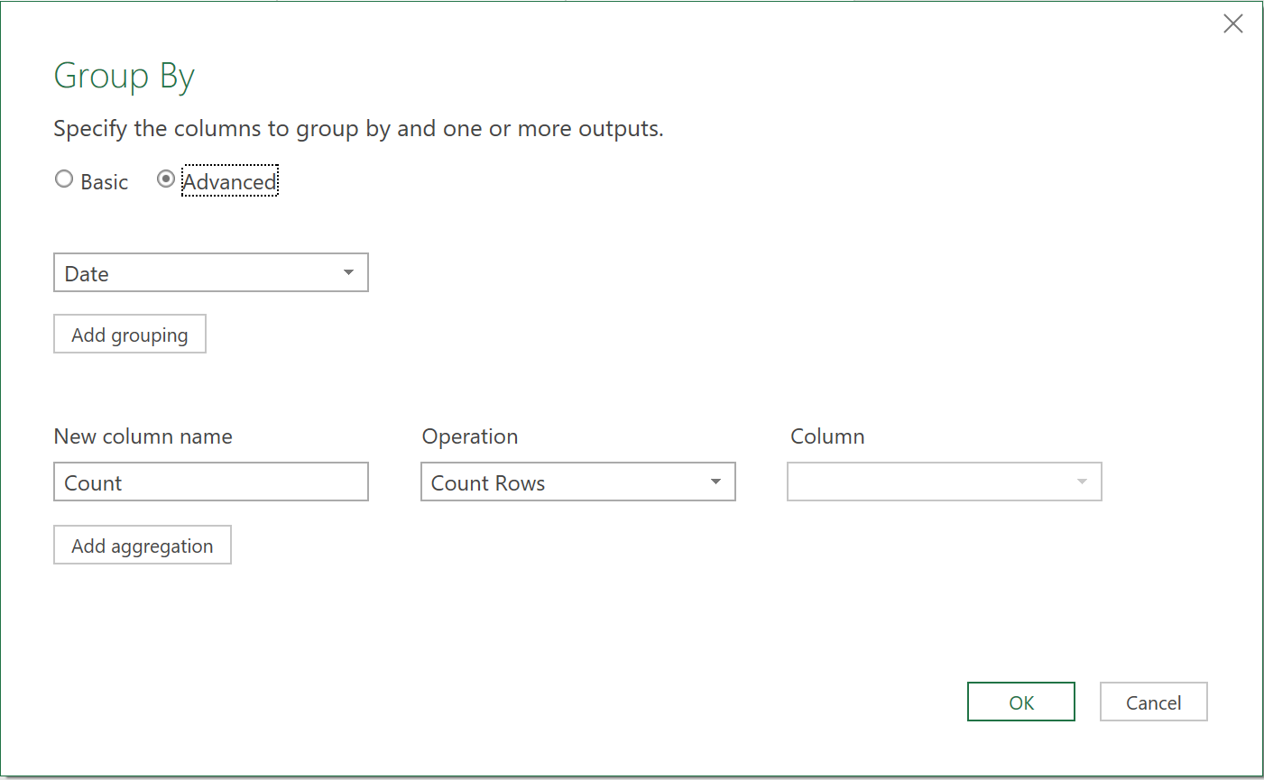
Click the ‘Add grouping’ button, to add another column to group by.
- Choose ‘Product Category’, like so:
Now, you need to determine how you want the data to be grouped:
- Change the New Column Name from Count to ‘Products Sold’
- Click the ‘Add aggregation’ button to add a new calculation
- Give the new column a name of ‘Sales GBP’ and set it to sum the ‘OTR Price’ column
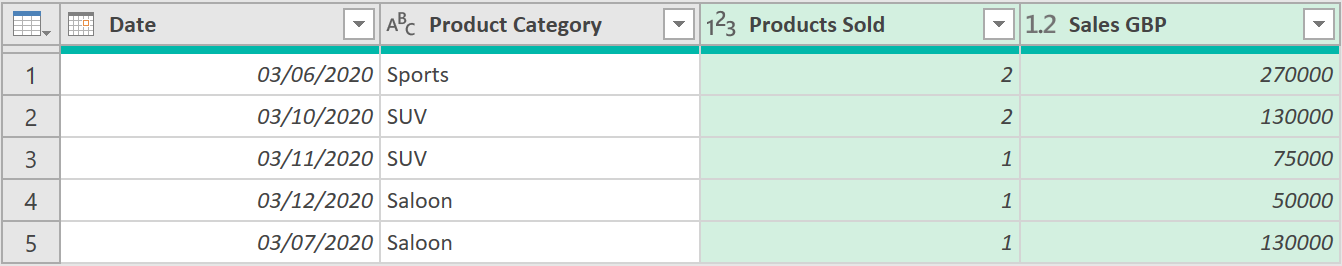
After clicking OK, the data should be grouped, like so:
The data can now be loaded into Excel:
- Change the query name to Cars_Grouped
- Go to the Home tab ➔ Close & Load
3. Create a Summary Statistic
Now you need to work out the top-selling product in each segment, and what it represents as a percentage of total sales for that Product Category.
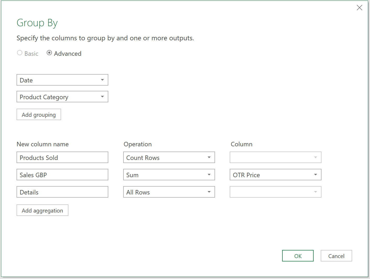
To do this, go back to the earlier Query, and modify the step called ‘Grouped Rows’:
- Click on the gear beside the ‘Grouped Rows’ step
- Add a new column at the bottom of the query
- Set the column name to ‘Details’ and set the Operation to ‘All Rows’
- Click OK
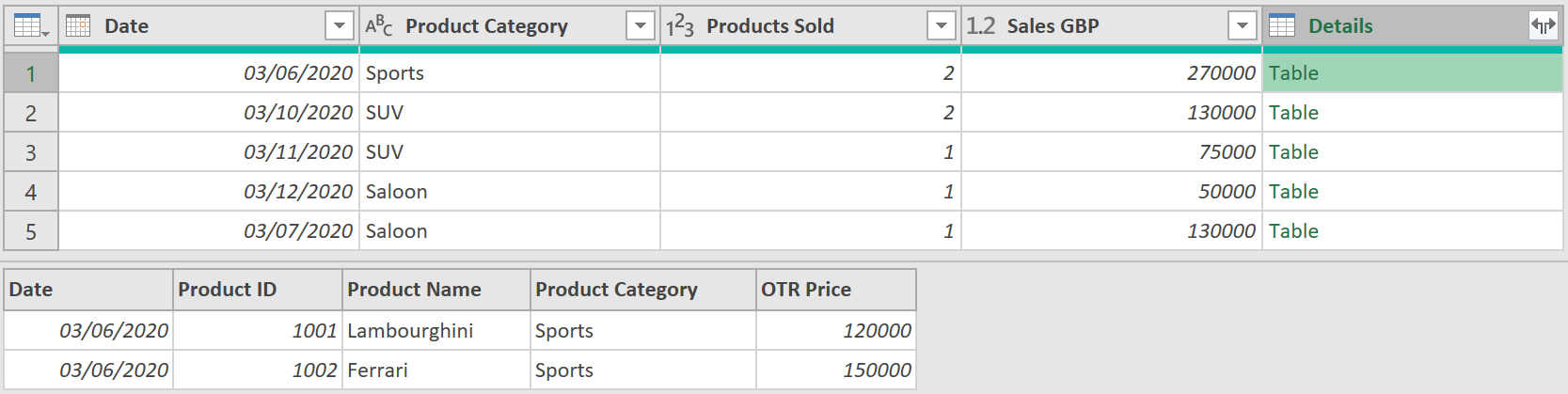
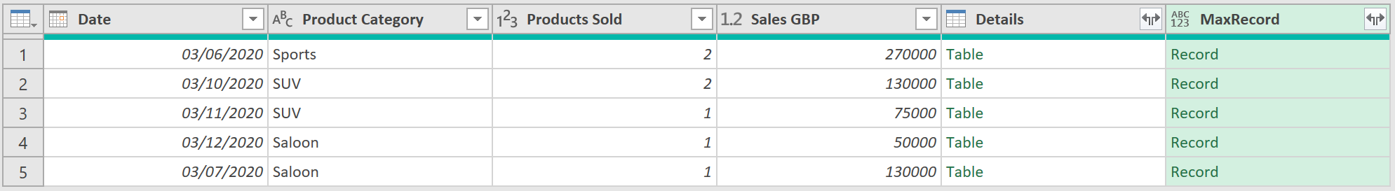
This adds a Table object to each row in the query, in a new column called ‘Details’. Each cell, in this column, contains the details of the rows from the previous step (before they were summarised) that make up each current row’s total.
Click next to the text ‘Table’ and Power Query will provide a summary of the detailed rows, that make up each summarised row, as shown in the picture below:
Now, to work out the top-selling sales item for each day, create a custom column, by doing the following:
- Go to Add Column tab ➔ Custom Column icon
- Call the column, ‘MaxRecord’ and use the following formula
= Table.Max ([Details], "OTR Price")
- Click OK
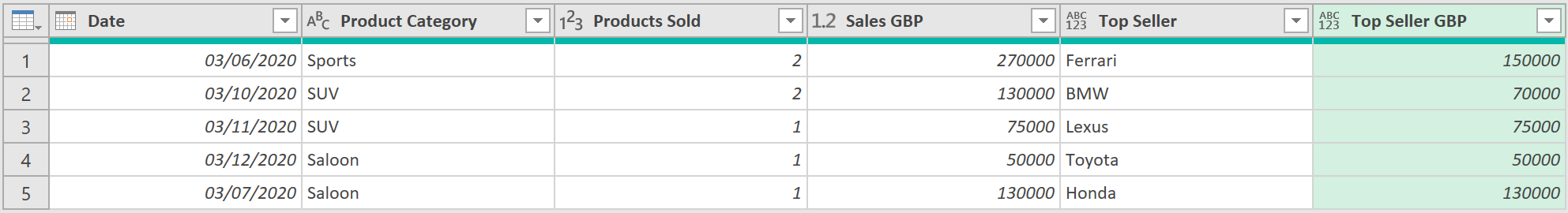
- Each cell now represents a Record object.
- Now click on the Expand arrow on the ‘MaxRecord’ column
- Expand the ‘Product Name’ and ‘OTR Price’ columns and uncheck the ‘use original column name as prefix’ option at the bottom ➔ OK
- Right-click the ‘Details’ column ➔ Remove
- Right-click the ‘Product Name’ column ➔ Rename ➔ ‘Top Seller’
- Right-click the ‘OTR Price’ column ➔ Rename ➔ ‘Top Seller GBP’
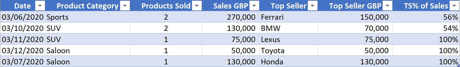
Finally,
- Go to Add Column tab ➔ Custom Column icon
- Set the column name to ‘TS% of Sales’ and enter the following formula:
= [#"Top Seller GBP"] / [#"Sales GBP"]
- Then select the TS% column ➔ Transform tab ➔ Rounding icon ➔ Round… ➔ 2
- Change the TS% column to a % Data Type
- Then Close & Load the query, and apply a Percentage style to the TS% column
The final output should look as follows, which was our original goal:
Feedback
Submit and view feedback